He just wanted to play football
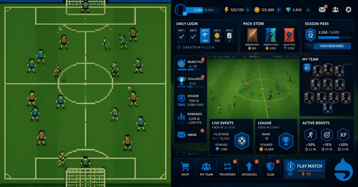
Earlier this week, Oscar wanted to play a football game on the tablet, so we downloaded FC Mobile.
We gave up.
Not because the football was difficult. We barely got to the football.
There were menus, rewards, player bonuses, cards, challenges and things being given to him despite the fact he had achieved absolutely nothing yet. Half the time it wasn't obvious whether he was about to play another person or the computer. He didn't know what most of the rewards were for, and neither of us particularly cared.
He just wanted to play football.
We eventually downloaded Miniclip's Mini Football instead. Within a few minutes he was playing, laughing and shouting at the tablet.
Job done.
That experience has been bothering me since, partly because I've spent a lot of my life around software and product design, but also because I spent some of it around games.
Maybe I'm showing my age, but I remember Sensible World of Soccer and, before that, Kick Off. They were simple, addictive and brilliant fun. Turn the machine on, pick a team and play football.
If you wanted something deeper, that existed too. Gremlin Interactive's Premier League gave you more to get involved with. Later there were games such as Codemasters' Club Football, which I'm slightly biased about because I had a hand in some of that era myself.
Or you could get properly involved, sit on the carpet with Tomy's Super Cup Football and maintain your own league table with a pen and paper.
Somehow even that felt like less administration than starting FC Mobile.
Old games weren't automatically better
It would be very easy to turn this into a misty-eyed argument that games were simply better when they came on floppy disks and cartridges.
They weren't.
A lot of old games were brutally difficult, explained almost nothing and assumed you'd read the manual. Some sent you all the way back to the beginning because you ran out of lives. Save systems were primitive or non-existent. Interfaces could be dreadful.
Retro gaming discussions are quite honest about that. In one recent conversation about wanting simpler games, somebody made the useful distinction that simplicity is not the same thing as easiness. Ninja Gaiden is simple to understand. Nobody sensible would call it easy.
That's the bit I think matters.
Kick Off wasn't easy either. Sensible Soccer could become competitive, tactical and difficult. But neither needed to teach me an internal economy before I was allowed to kick a ball.
The complexity came after I'd started playing.
Modern games can obviously do vastly more. Online competition, huge player databases, live events, customisation, persistent teams, social features and regular content updates can all make a game richer when the player wants them.
The problem starts when all of that gets placed between the player and the reason they opened the game.
The football is actually in there
To be fair to EA, FC Mobile contains exactly the sort of thing Oscar wanted.
EA introduced an updated Quick Match mode in May, allowing players to use clubs, national teams or their own team in matches with friends. The football hasn't disappeared. It is there.
But look at some of the systems surrounding it.
EA's own explanation of Drafts describes Draft Vouchers, Gems, FC Points, Player Items, different Draft pools, Phase Exchanges, Phase Tokens, Player Picks and several types of vouchers. That may make complete sense once you're invested in building a team and understand what all of those things are worth.
Oscar had none of that context.
Why would he?
He's eight. He likes football. He saw a football game and expected to play football.
He's not alone in finding the surrounding product difficult to read. A new FC Mobile player posted on Reddit in June after coming from the console games and said the menus looked overwhelming. They had gems, packs and ranking systems in front of them and weren't sure what they were supposed to do first.
That is a pretty fundamental first-use problem. The game can contain exactly what somebody wants and still lose them before they find it.
More systems don't necessarily create more depth
This isn't confined to football.
One PUBG player wrote about the number of currencies and submenus in that game after already spending 500 hours with it. Their list ran through BP, G-Coin, credits, keys, fragments, crafting systems, event points, polymers, scraps and schematics before eventually asking what on earth was going on.
Another player replied that they were level 135 and still had no idea what to do with some of it, and didn't care enough to learn.
That's the interesting bit.
A product can have enormous depth and still be understandable. It can also have enormous surface area without giving the player any more meaningful choices.
The same complaint appears around strategy games. Someone trying Age of Empires IV during a free weekend described opening the main menu and being faced with floating boxes, timers, symbols, XP, tabs and several possible routes into what looked like the same basic action. They wanted to start a game and weren't sure where to begin.
None of those individual features necessarily sounds unreasonable. That's how products get here. Every team adds something useful. Every event needs somewhere to live. Every new system needs a route into it. Every commercial feature needs visibility.
Then somebody new arrives and sees all of it at once.
We do exactly the same thing in ordinary software.
We add another dashboard because there is more data. Another setting because someone asked for flexibility. Another notification because the user might miss something. Another onboarding step because a feature needs explaining.
Eventually the product knows how to do hundreds of things but becomes harder to use for the one thing somebody actually arrived to do.
Rewards are strange when nothing has been achieved
The part of FC Mobile that really confused Oscar was the volume of rewards.
He had barely played anything and the game was already giving him stuff.
I understand why. Giving a new player things feels welcoming and generous. It creates movement and gives them something to build with.
But a reward only really means something once I understand what I did to earn it and why I might value it. Give me a player, currency, upgrade or collectible before I understand the game and you've also given me another thing I need to understand.
The same applies to tutorials and onboarding. A useful discussion in r/gamedesign described one tutorial principle as "5 seconds to fun": engage the player quickly, then scaffold the information as it becomes relevant.
That feels almost embarrassingly obvious when written down.
Yet products constantly try to explain themselves before the user has experienced enough to care about the explanation.
A better approach is often progressive disclosure. Give somebody what they need now. Introduce the next thing when it becomes useful.
Sensible World of Soccer didn't need to explain why football was fun before letting you play it. You discovered the leagues, transfers, tactics, enormous database and all the rest because you were already enjoying the football.
By the time you got into the deeper stuff, you already understood why you cared about it.
When playing starts to feel like work
There is another problem when rewards, progression and live events keep stacking up.
Daily objectives. Weekly objectives. Season passes. Limited-time rewards. Login bonuses. Events. Streaks.
Each one can make sense by itself. Put enough of them together and a game can start creating obligations.
A player in r/patientgamers described enjoying Destiny 2 but reaching the end of a season pass feeling as though they had to keep playing because they'd paid for it and didn't want to lose the rewards. By the time they completed it, they were burned out and needed a break from a game they actually liked.
Their distinction was simple. They no longer felt that they wanted to play. They felt that they had to.
Which makes engagement a slightly odd measure of success. Somebody can be coming back every day because the game has trained them not to miss something, while enjoying it less every time.
Eventually some of them leave.
This is one of the dangers of optimising the measurable parts of a product without paying enough attention to the reason somebody chose it in the first place.
The menu has a lot more jobs now
Game interfaces also have to carry far more than they used to.
A modern live-service game can be a game, shop, social space, event calendar, subscription product, content channel, competitive platform and persistent account all at the same time.
All of those things need somewhere to go, and increasingly they end up in front of the player before the game does.
There was a good debate about this recently in r/gamedesign. The original poster argued that modern game UI was becoming worse as interfaces borrowed too much from web and mobile design. Other designers pushed back, quite reasonably, pointing out that there has always been terrible game UI and that cross-platform design, production constraints and the sheer number of systems games now support all contribute.
That disagreement is useful because the answer probably isn't "old UI good, new UI bad".
The more interesting question is whether the interface is helping the player do what they came to do.
A beautiful, modern interface can still be frustrating if the common action is buried three levels down. An ugly old menu can still work surprisingly well if the thing you need is immediately obvious.
Game designers call this flow. Product teams would usually call parts of it user experience. Oscar called it something else entirely.
"Can we play a different game?"
That's probably the metric that matters.
We do this outside games too
The annoying thing is, none of this is particularly unique to gaming.
Someone arrives at an analytics product because they want to know whether a campaign worked. We make them configure a workspace, invite colleagues, define attribution rules and walk through seven onboarding screens first.
Someone buys accounting software because they need to send an invoice. We introduce dashboards, integrations, categories and automation before helping them get paid.
Someone tries an AI product because they want an answer to a question. We ask them to create projects, choose modes and understand model names.
Every additional capability may be useful. The mistake is assuming usefulness means it deserves equal prominence from the beginning.
The first experience has a much simpler job: help the person do the thing that caused them to turn up.
Once that works, you've earned the right to introduce everything else.
Oscar's review was probably the most useful one
Oscar doesn't know anything about retention mechanics, progressive disclosure, information architecture or live-service monetisation.
He doesn't need to.
FC Mobile felt confusing, so he stopped playing it.
Mini Football let him play football, so he carried on.
For all the analytics, research, workshops and product frameworks we use, sometimes that's the clearest user test you're ever going to get.
I'm certainly not suggesting we should go back to 1992, much as part of me would happily spend an afternoon doing exactly that. Modern games can be richer, larger and far more ambitious than anything we could have built then.
But the old games did understand something worth keeping.
Before the progression, rewards, currencies, challenges, news, stores, seasons and endless menus, give me a reason to care.
Let me play the bloody game first.